Images
Responsive images
Use the .bsk-img-responsive class to scale images nicely within their parent element. Use the
centred block classes to centre a responsive image.
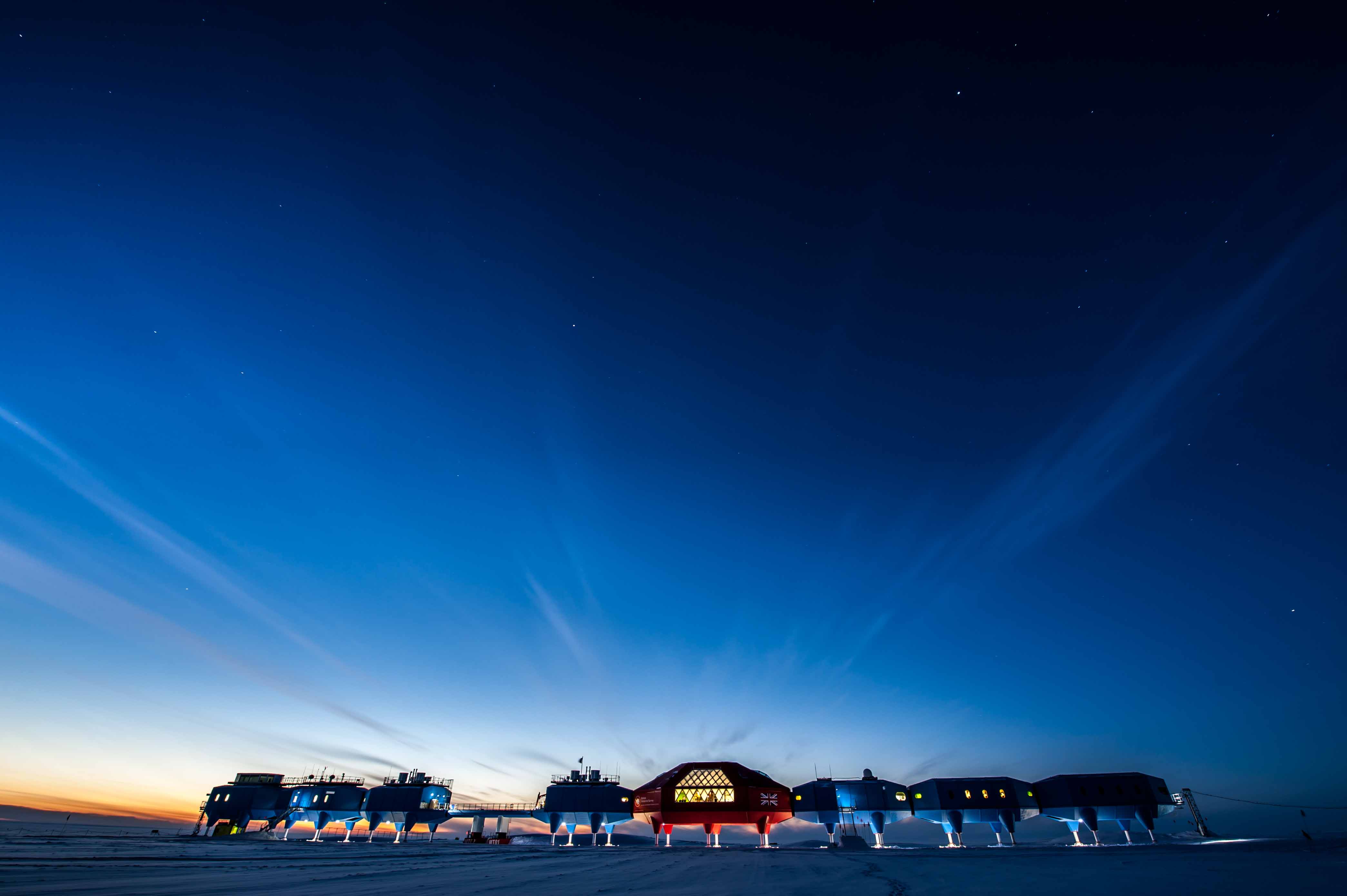
<img class="bsk-img-responsive" src="/img/site-masthead-tom-welsh.jpg" alt="Sky at Halley VI research station">Image shapes

<img class="bsk-img-rounded" src="/img/placeholder-150.png" alt="Rounded image" >
<img class="bsk-img-circle" src="/img/placeholder-150.png" alt="Circular image">
<img class="bsk-img-thumbnail" src="/img/placeholder-150.png" alt="Thumbnail image">